
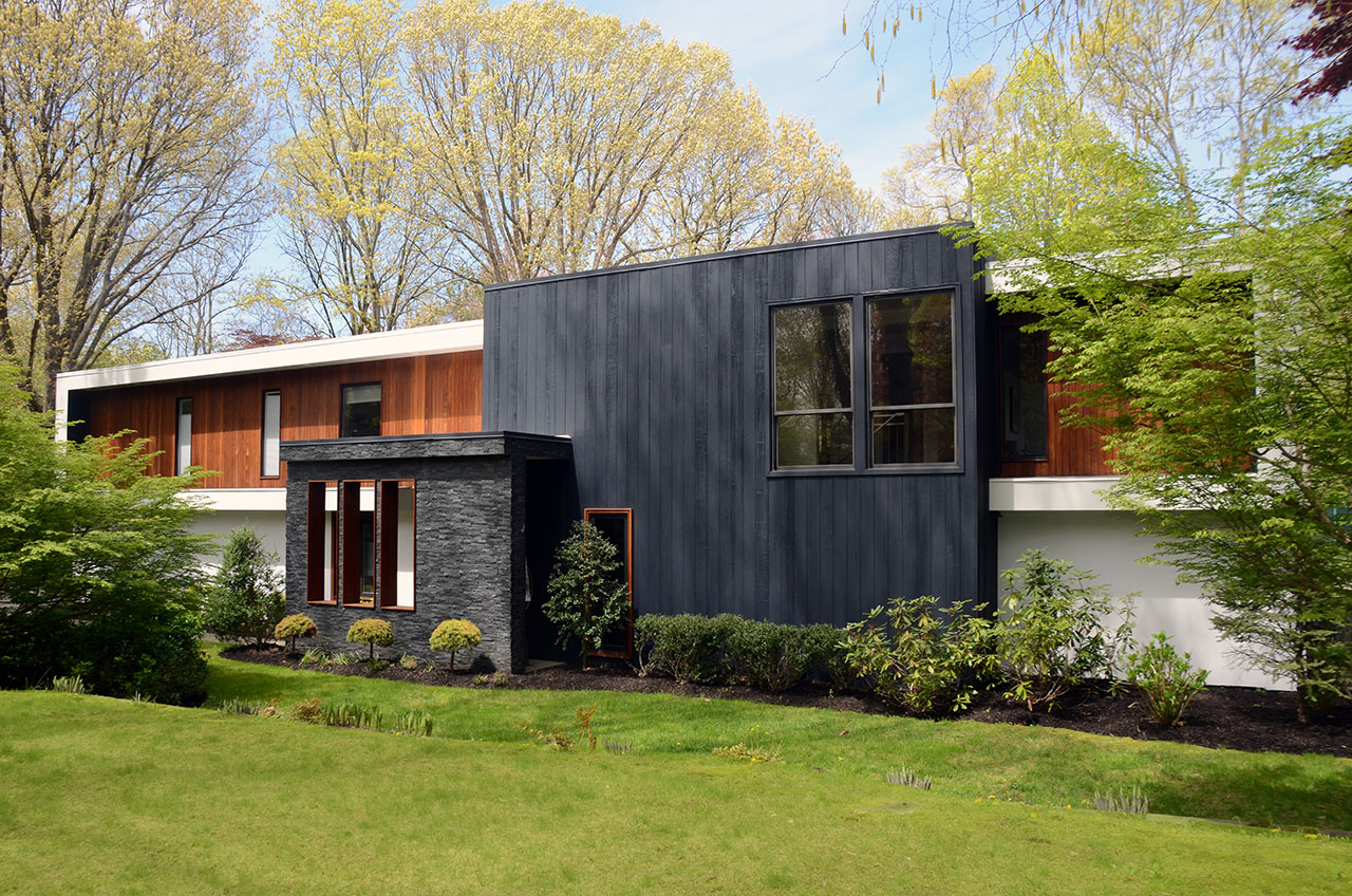
An old modern house with a dated façade in Port Washington gets a facelift.
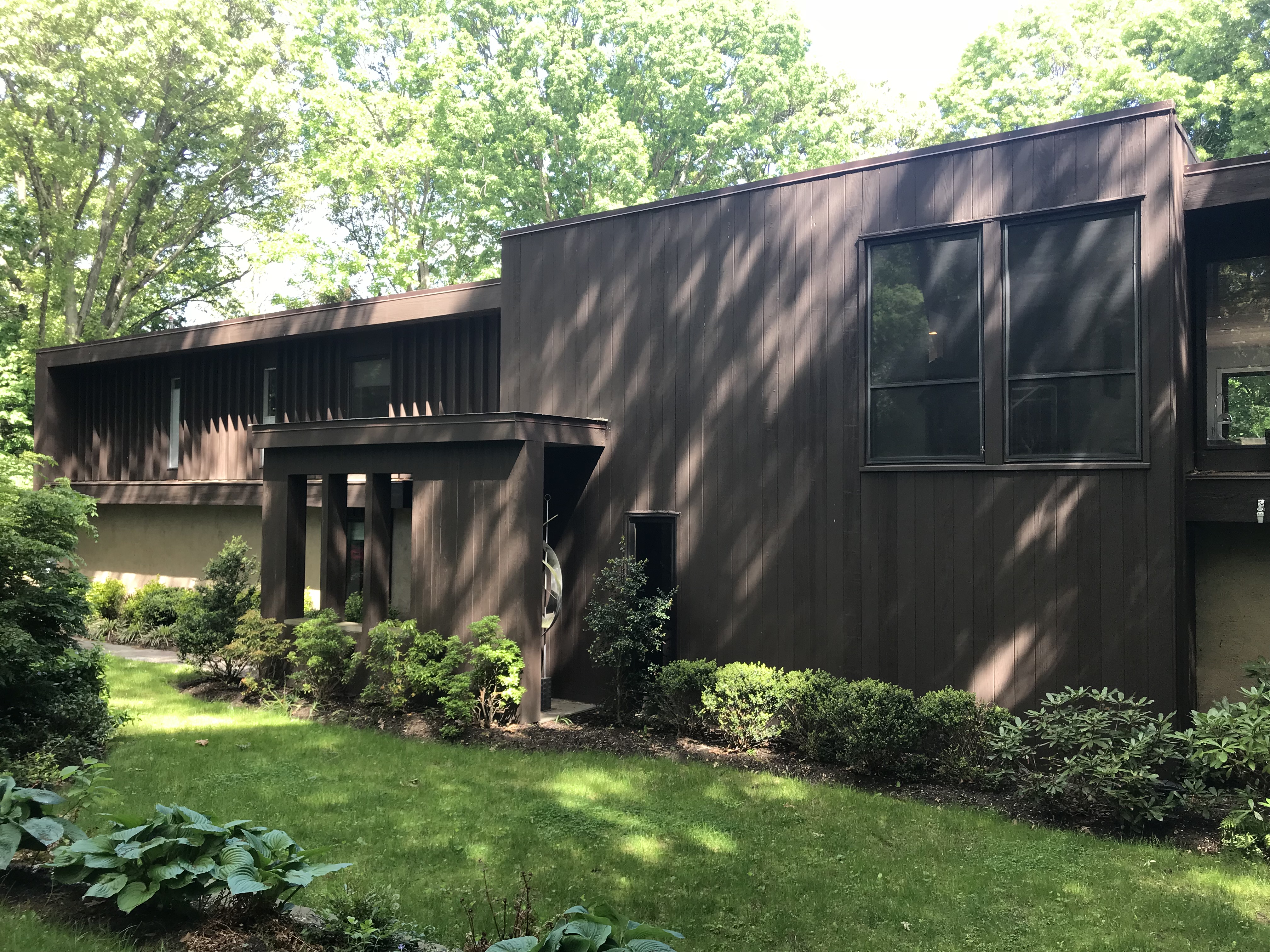
The owner wants a façade makeover for a house in an affluent neighborhood of Port Washington, NY. In this location, there are many designer houses. To increase market value and become more palatable to potential buyers in such a competitive market, the obvious option was to upgrade the façade to give it a more modern look and feel. He entrusted the task to Eisner Design.
With a set budget of $150K, the project came with its own set of challenges. We need to cover the entire house, although the main focus would initially be almost exclusively be concentrated on the front façade alone, so that Eisner Design could give it a modern and high end design appearance it desperately needed.
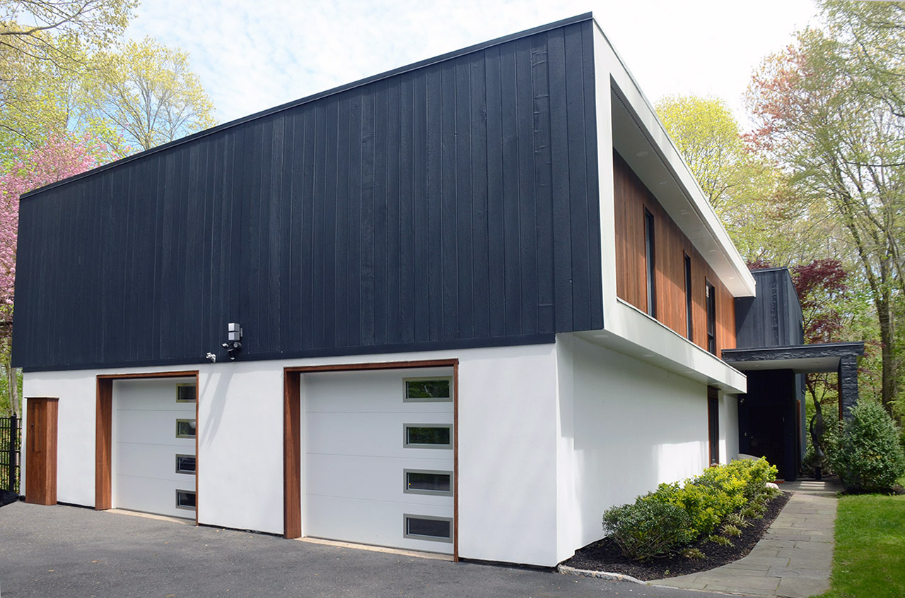
The existing house has some interesting features where a large frame engulfs the entire structure and wraps around the side of the house. We took advantage of the frame and changed both material and color placing a strong emphasis on the entry. We designed a canopy vestibule entry made of grey stone and created slots of wood frame openings to allow more light into the vestibule.
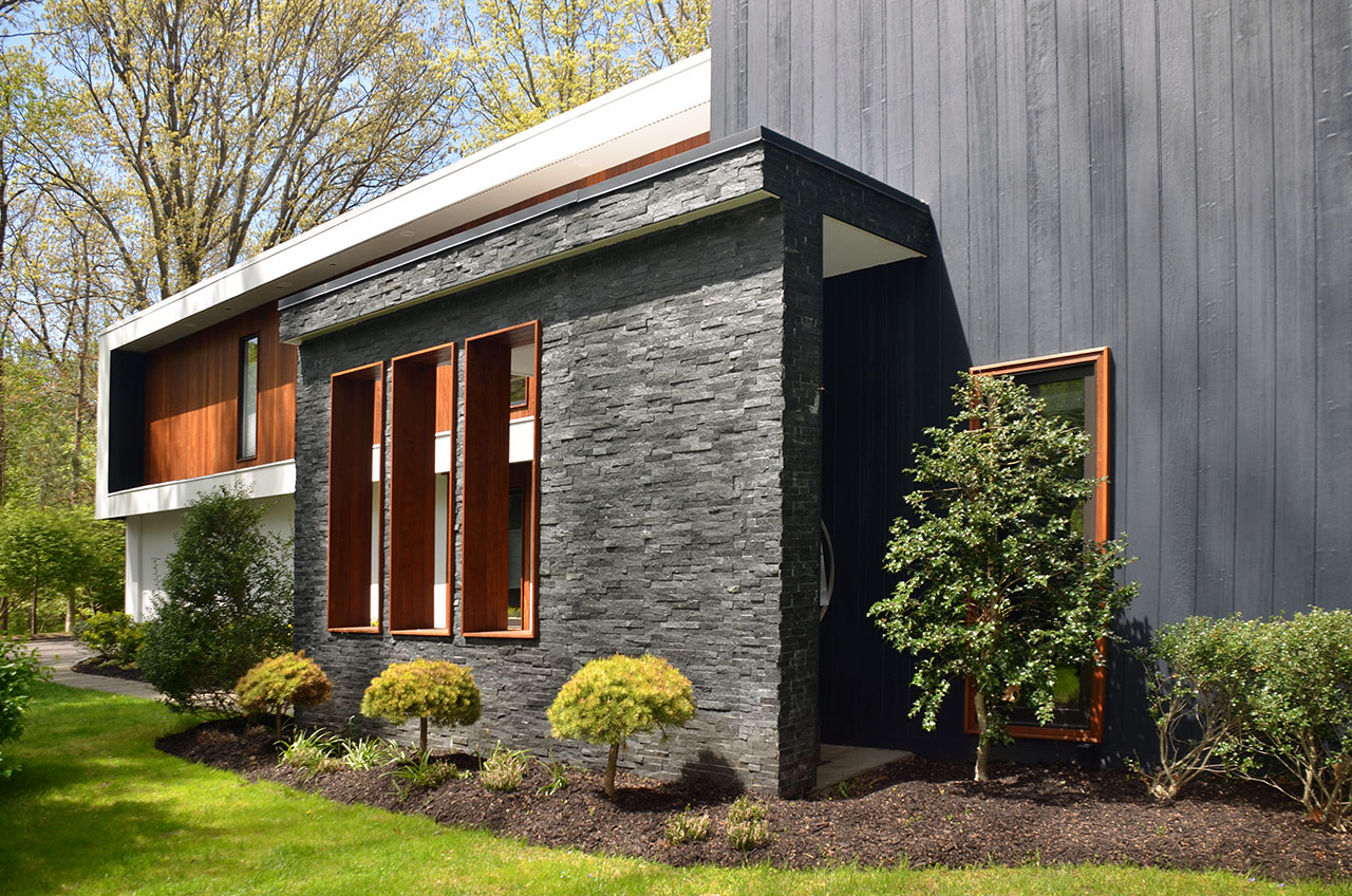
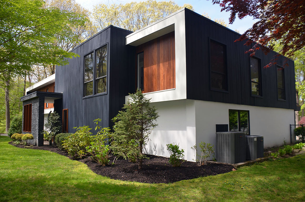
A walkway from the garage leads into the entry vestibule that sits against the existing wall with windows on the upper right corner. We decided it should be all painted black in contrast with the white frame and base of the house to set the main focus on the entrance. All existing window openings would keep their current design but would get new stained cedar slats over the existing walls. The wood colors and paint were carefully selected to fit into the landscape of the house.
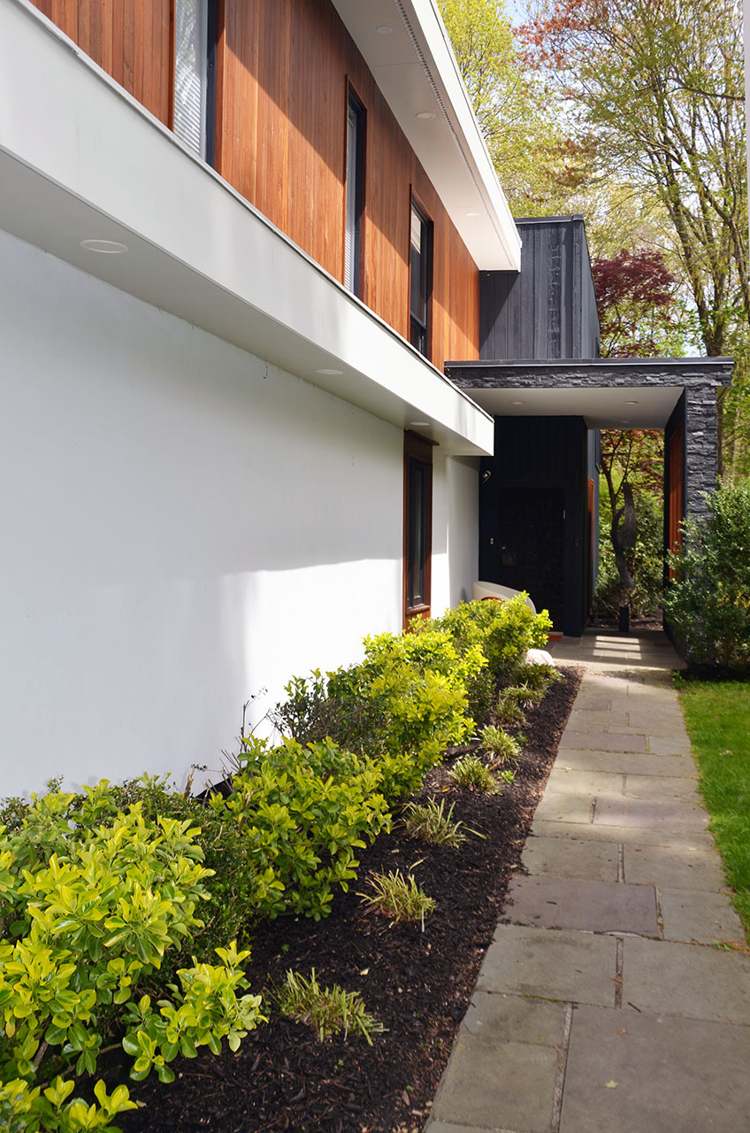
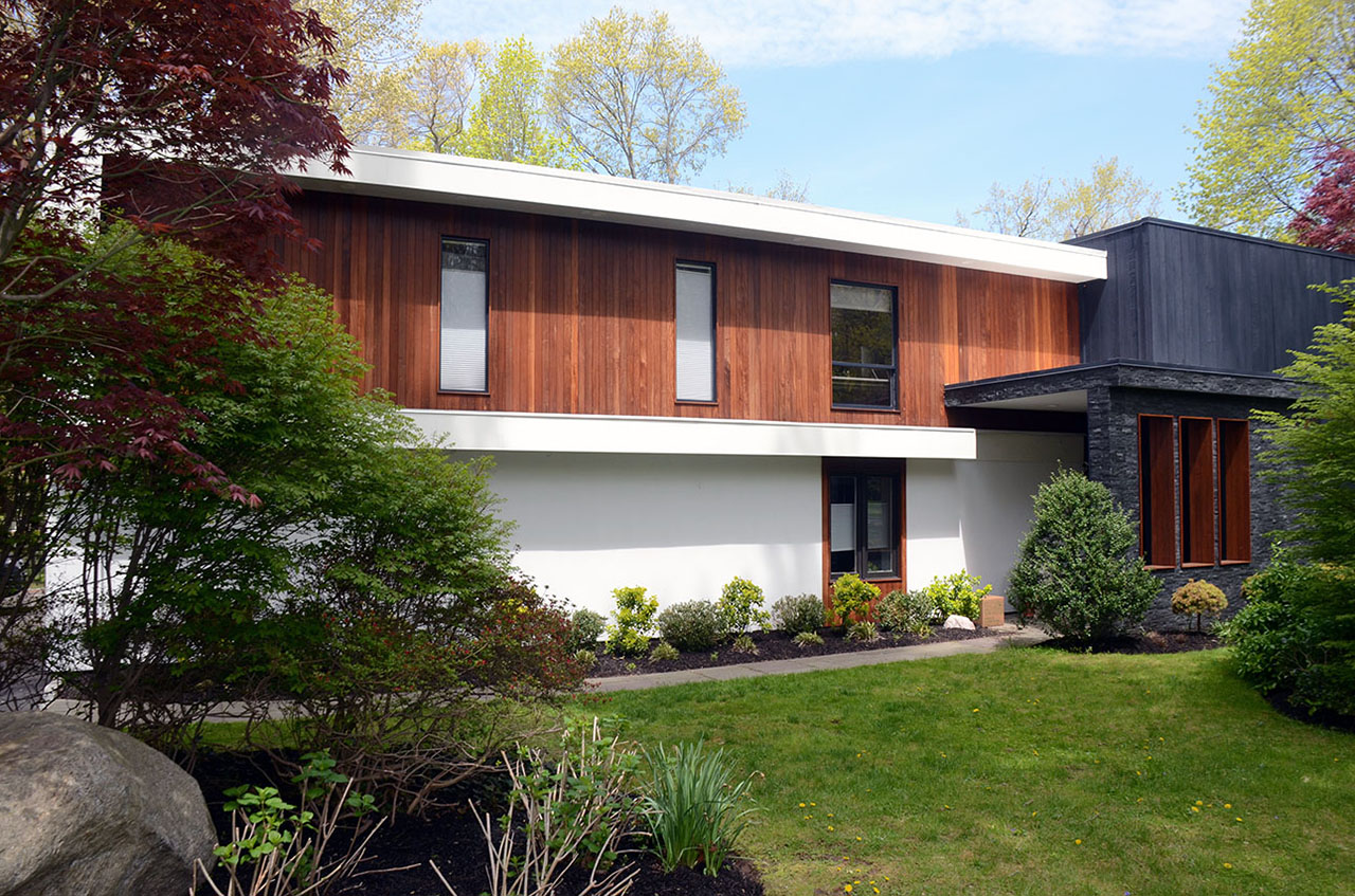
As you walk to the garage side, its doors were selected to small slots on one side to match with the slot theme at the entrance vestibule. Each garage and side doors all have the wood door frames to match the wood used throughout the rest of the property. The second floor above the garage was painted black keep a cohesive look across the entire house.
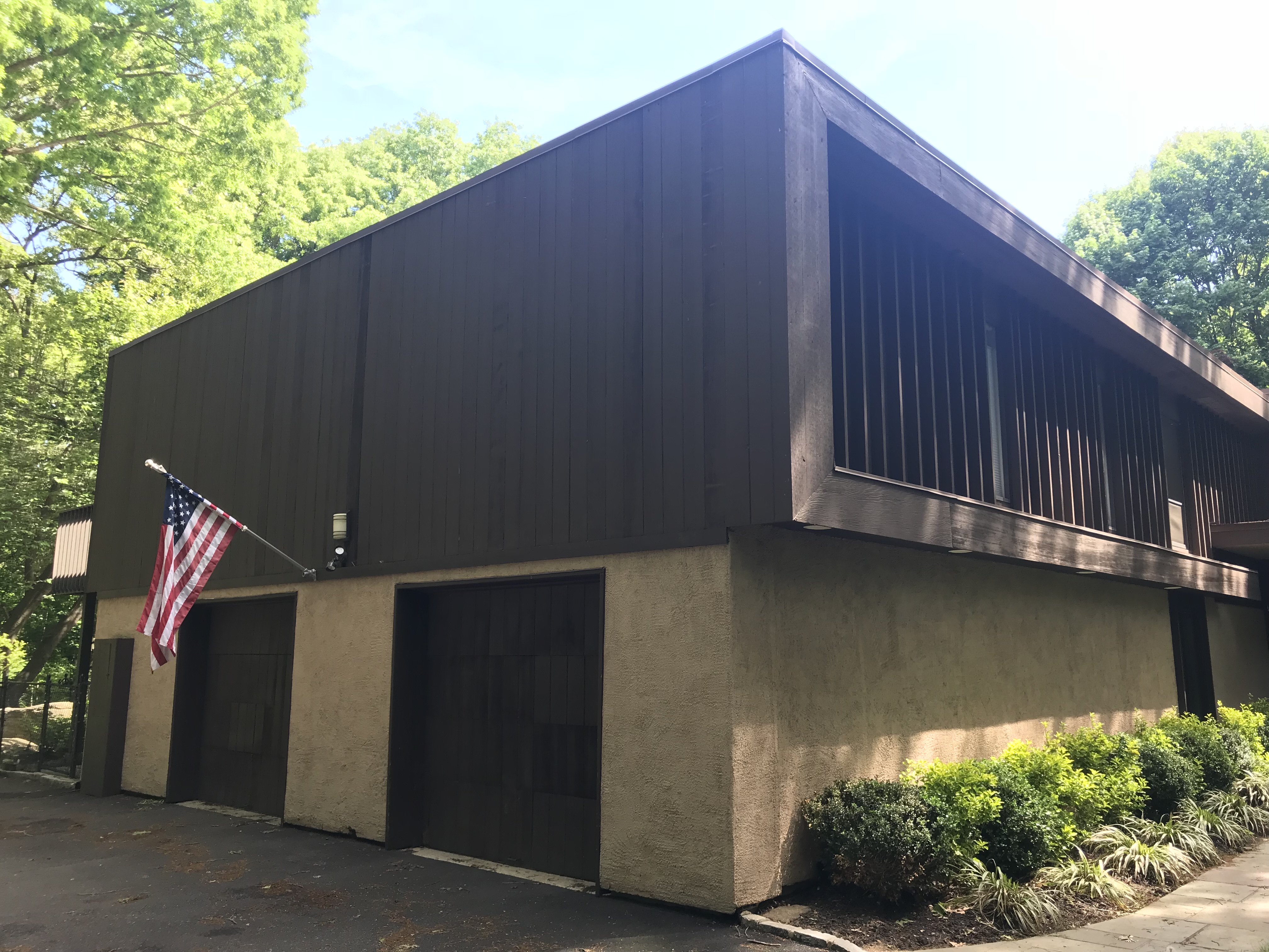
The back of the house minimally designed due to budget restrictions. The patio porch was partially removed so that more light would reach the first floor. The existing upstairs patio doors present in each room get a Juliet balcony with cable railings. The rest of the patio deck is still roomy enough for tables and furniture.
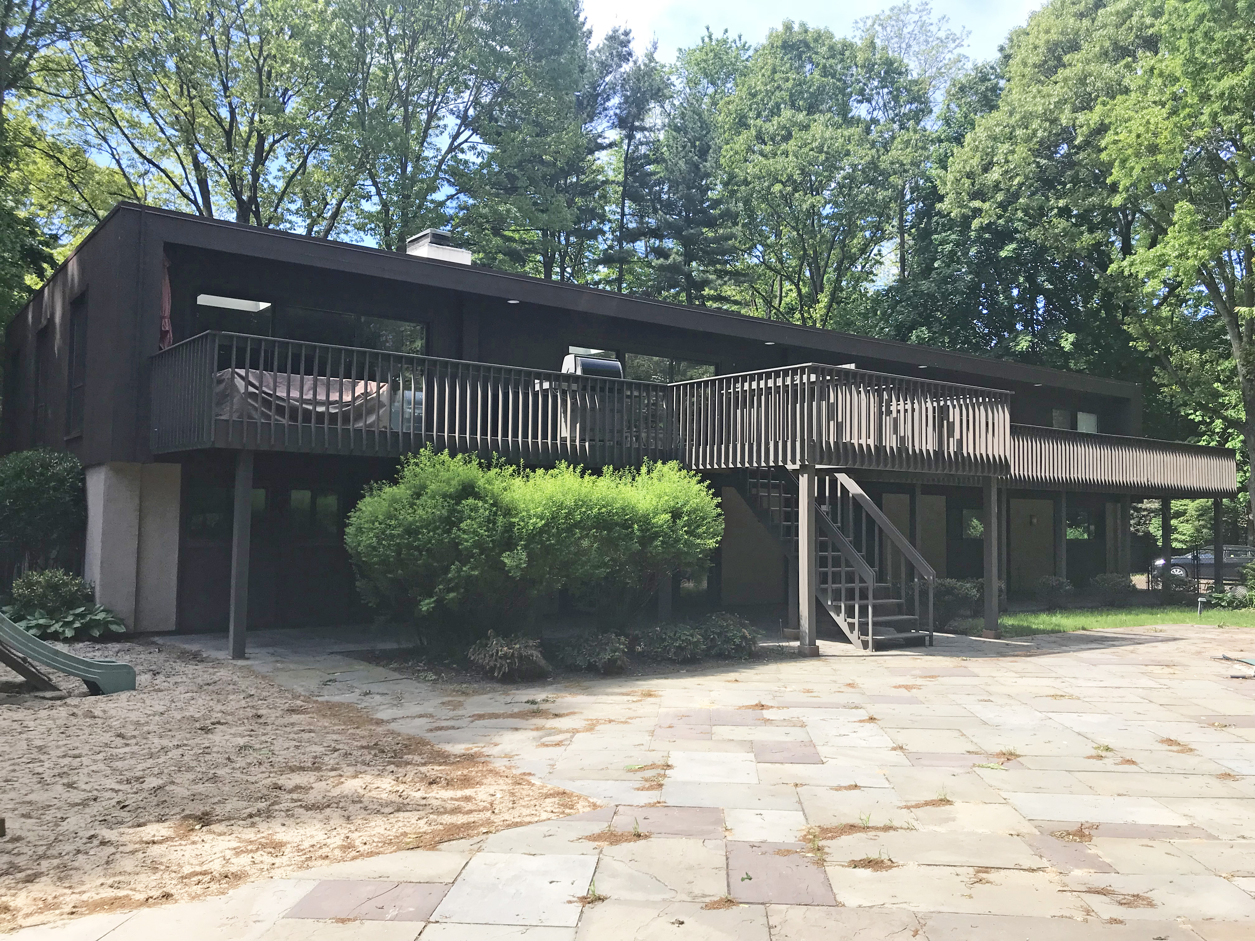
We decided to give the rear wood slats a black paint rather than using the stained cedar slats at the front due to budget reasons. The challenge has made the rear elevation fit within the contextual design of the house and makes the front façade stand out from the rest of the house.
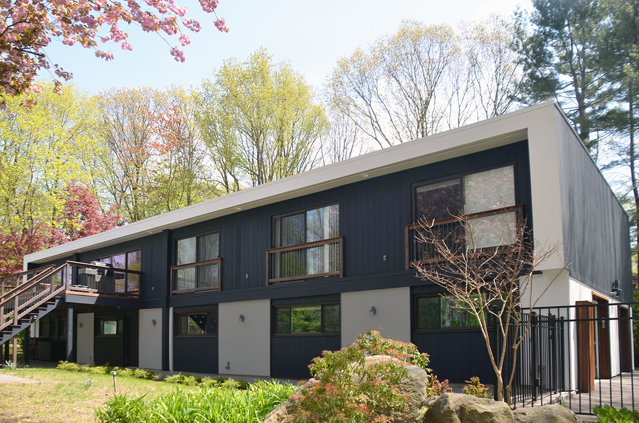
Although we have designed much more for the rear using a connection to the yard and pool, the owner said it would be done at Phase 2. So let’s hope he will keep his word.
We Were Nominated as a Top Interior Design Company in New York by The Startup Pill
These are the Top Interior Design Startups in New York (2021)
Our kid’s playroom basement project in East Hampton is featured on Contemporist Ezine.
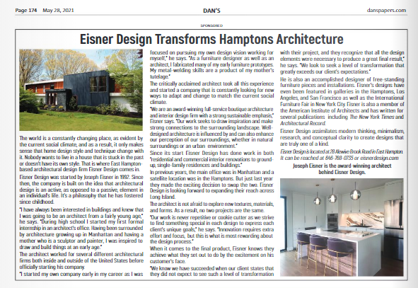
We are on East Hampton Dan’s paper Advertorial.
